Zen Caregiving Project / San Francisco, CA
Zen and accessibility.
An accessibility-driven redesign grounded in assessment data for a local nonprofit championing compassionate caregiving, mindful practice, and human connection.
01 / The context
Beginning with their story and their intentions.
The Zen Caregiving Project is a San Francisco Bay Area nonprofit that supports caregivers and those they care for through education, mindfulness practice, and human connection.
Because their work centers on care, accessibility is not an add-on. It is essential to how people find and experience that support online.
The guiding question
How can Zen Caregiving's digital spaces help everyone, regardless of ability, access the support they need?
02 / The goal
The goal is simple and human:
Ensure the care offered through the organization's mission is reflected in how people experience its website. Improve access, Improve Impact.
The framework
Four principles guided the assessment.
The study followed the four foundational principles (Perceivable, Operable, Understanding and Robust/ POUR) of the Web Content Accessibility Guidelines (WCAG) — a shared standard for making the web work for everyone.
In parallel, I reviewed alignment with key accessibility laws and regulations, including ADA Titles II and III, Sections 504 and 508 of the Rehabilitation Act, and the Twenty-First Century Communications and Video Accessibility Act (CVAA). This ensured recommendations supported both inclusive design and legal compliance.
Perceivable
All information and interface elements are presented in ways everyone can sense and understand.
Content can be seen or heard by all users.
Operable
Everyone can use and interact with every part of the site, no matter their abilities — no action is off-limits to anyone.
Interface elements are usable through various inputs.
Understandable
People can truly comprehend the information and feel confident using the interface.
Content and interactions are clear and predictable.
Robust
Content and interactions can be interpreted reliably by a wide variety of users and assistive technology.
The findings
ZEN CAREGIVING HOMEPAGE FINDINGS, THROUGH THE POUR CRITERIA
Here is a snapshot of the P-O-U-R checks I ran on the Zen Caregiving Homepage — a quick look at what I found, and highlighting where a little more care could go a long way.
The focus
Where the homepage fell short.
Ten of the eighteen checks came back with room to grow. Rather than treat them as flaws, I grouped them into four themes — each one a clear starting point for the redesign.
Seen, but not described
Key images, including the linked ones near the footer, have no alt text — so visitors using screen readers miss part of the story.
Structure that speaks
Buttons like "Click here" and "Donate" don't say where they lead, parts of the page skip past screen readers, and content isn't always in a clear order.
Forms with no helping hand
The newsletter form offers no instructions or feedback, leaving visitors to guess whether if their entry went through.
Easy on every set of eyes
Low-contrast headings and buttons, color alone carrying meaning, text baked into images, and no in-between text sizes make the page harder to see and read.
Each of these became a concrete recommendation — small, thoughtful changes that turn "getting by" into feeling genuinely welcomed.
The caregiving page
The same lens, on the Caregiving page.
Next, I brought the same Perceivable checks to the Caregiving page — here's how it held up.
| Criterion | Result | What I found |
|---|---|---|
| 1.1.1Non-text Content | Fail | An image in the “CAREgiving, live and online” area has no alt text — screen readers can't describe it, and visitors would never know it opens a new page. |
| 1.2.1Audio-only and Video-only | Pass | The video on this page works nicely with screen readers. |
| 1.2.2Captions (Prerecorded) | Pass | Captions are readable at larger sizes, with fullscreen and speed options — though a transcript isn't offered. |
| 1.2.3Audio Description or Media Alternative | N/A | Not applicable to this page. |
| 1.3.1Info and Relationships | Fail | An image that doubles as a link doesn't announce itself to screen readers. |
| 1.3.2Meaningful Sequence | Fail | That same linked image leaves screen readers without a clear order to follow. |
| 1.3.3Sensory Characteristics | Pass | CTA buttons and links all come with clear text. |
| 1.3.4Orientation | Pass | The page adapts nicely to both landscape and portrait mode on tablets and phones. |
| 1.3.5Identify Input Purpose | Pass | The Sign Up form guides screen reader users through each field — first name, last name, email — and points out the “I'm not a robot” checkbox. |
| 1.4.1Use of Color | Pass | Error feedback pairs color with text and an icon, so the message lands no matter how you see it. |
| 1.4.2Audio Control | Pass | Videos wait for you to press play, and the controls work by keyboard too. |
| 1.4.3Contrast (Minimum) | Pass | A few footer links (“Individual caregivers”, “organizations”) and CTA buttons like “Sign Up” fall below the required contrast ratios. |
| 1.4.4Resize Text | Fail | Zoom in and the “Better caregiving through mindfulness” heading ends up halfway covered by the video beside it. |
| 1.4.5Images of Text | Pass | The page uses real text that can be resized. |
| 1.4.10Reflow | Fail | On a smaller screen or phone, the full heading doesn't display and part of the reCAPTCHA gets cut off. |
| 1.4.11Non-text Contrast | Fail | The footer sign-up button and the “See our guided meditations” button don't meet the 3:1 contrast requirement. |
| 1.4.12Text Spacing | Fail | Spacing adjustments make some words overlap unless line height and paragraph spacing change together as a unit. |
| 1.4.13Content on Hover or Focus | Pass | Hover content is easy to dismiss, and dropdowns stay put while you explore them. |
Ten checks passed on their own — the Sign Up form in particular offers visitors a warm helping hand. Seven became part of my recommendations, and one simply didn't apply here.
The focus
Where the Caregiving page fell short.
Seven checks here came back with room to grow. Grouped together, they tell one clear story — and each became a starting point for the redesign.
A linked image in silence
The "CAREgiving, live and online" image has no alt text, doesn't announce it opens a new page, and leaves screen readers without a clear order to follow.
Squeezed out of view
Zoom in and the video covers the "Better caregiving through mindfulness" heading; on smaller screens, the heading and the reCAPTCHA get cut off.
Buttons that blend in
The footer sign-up button and the "See our guided meditations" button fall below the 3:1 contrast requirement, making them easy to miss.
Spacing that collides
When visitors adjust text spacing, some words overlap — unless line height and paragraph spacing change together as a unit.
Each of these findings fed straight into my recommendations — small, thoughtful fixes so every visitor sees the whole story.
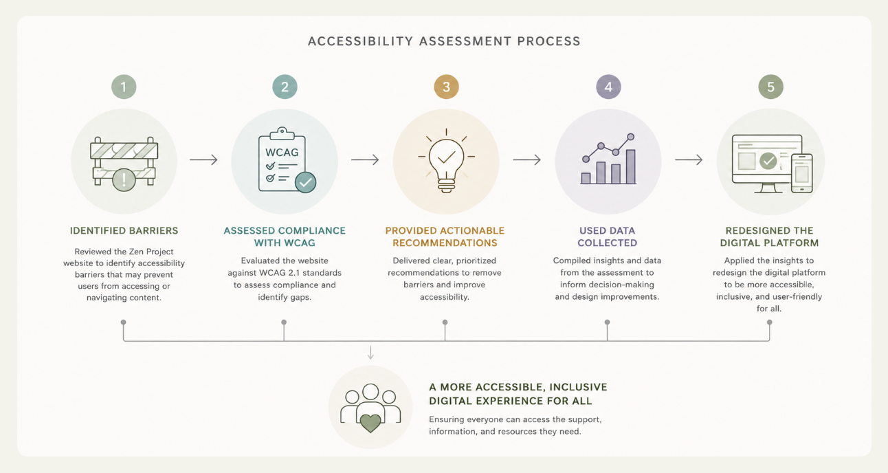
03 / The work
From understanding to redesign.
Assess accessibility
Study the nonprofit's existing digital presence to understand where access could be improved.
Use the findings
Translate the information gathered into recommendations for a more accessible experience.
Design with care
Reimagine the digital presence around the people seeking care and connection.